Written by Will Howard (Software Consultant)
Statistics gives us many useful concepts, and proper use of our sales data can help us identify areas of growth and problems on the horizon. But we need to be aware of the pitfalls in our data analysis.
As someone who helps a lot of businesses get the numbers they need to set their business strategies, I often reflect on Abraham Wald, a statistician during World War 2 as showing an important lesson that can be useful to remember in business.
Very brief history lesson:
During World War 2, Abraham Wald realised the concept of Survivorship Bias in bombers returning from sorties. . Plans for armouring bombers based only on those that survived showed that most damage was in the wings, central fuselage, and around tail gunner. The US Army originally planned were to reinforce armour in these places. But this misses that these are all of the places that survived the bombing expedition. The places to look at for best investment outcome are the places where planes get hit but don’t return. (For more information, I recommend reading this excellent article on Survivorship Bias (YouAreNotSoSmart.com – Survivorship Bias).
In business it’s often easy to see where sales are, we know which regions are performing well, and can recognise superstar sales people but identifying weak regions, and the reasons behind those regions failing, takes more work. Knowing what all successes have in common doesn’t tell us anything about what failures have in common, and we need to hunt for both sides of the coin. Of course, it’s impossible to know exactly why a sale was lost, but we can hope to track what we do know better.
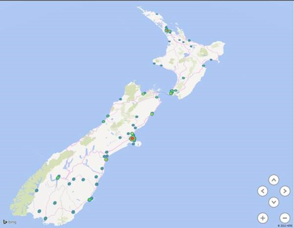
Microsoft’s Power BI included in the latest versions of Microsoft Office makes it easier than ever to visualise sales information by region, adding geotagging to your data allows you to see not only where your success regions are, but also where your coverage gaps are. Even completely untagged data can be interpreted into a usable format with not too much work, allowing you to visualise your strengths, and weaknesses.
If you combine not only sales information, but lead information captured using a CRM, into the equation you can get a picture of your pipelines. The best sales team in the world won’t be able to sell in a region where there are no prospective leads at all, or if the lead quality being fed to them is low. By tracking leads, conversion rates, and resulting sales, you can see which areas of your business are performing well, and where targeted assistance would most help. Maybe most importantly it will tell you where you’re in a boom, and can ease off on further sales measures, and where you’re performing worse than expected and more investment will get you the best return on your dollar.
Remember, your best investment might not be in strengthening the already strong regions, it can often be in aiding those places you’re most vulnerable, and focusing only on the bright zones can leave you vulnerable to the dark.

Caption: Hotspots in Auckland, Wellington and Christchurch, why no hotpsot in Hamilton? The missing points are as important as the ones that are present.


